Viewing Trends
A trend is one of the most useful indicators in DQM. They provide a visual representation of data compared in time. It allows you to determine whether data has become better or worse (DQ tab) and how it influences business (BI tab).
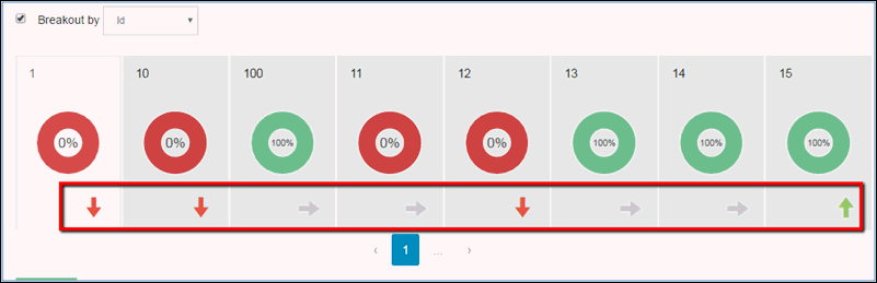
In the DQ tab, trends are displayed in the following ways:
- If data has improved. A green arrow pointing up is displayed.
- If data has deteriorated. A red arrow pointing down is displayed.
- If data remained the same. A grey arrow pointing right is displayed.
- If there is no data to compare with. A grey no trend icon is displayed.
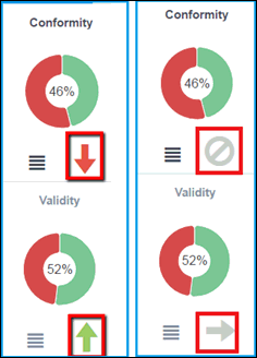
In the BI tab, trends are displayed slightly different:
- If data has improved. A green arrow pointing down is displayed.
- If data has deteriorated. A red arrow pointing up is displayed.
- If data remained the same. A grey arrow pointing right is displayed.
- If there is no data to compare with. A grey no trend icon is displayed.
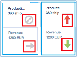
The difference between trends in the DQ and BI tabs is that the DQ tab trends show whether data quality has improved or diminished, while the BI tab trends show whether business loss increased or decreased. That is why it is good if the arrow is pointing up in the DQ tab, but bad if it is pointing up on BI tab (for example, quality improved in the DQ tab and business loss increased on the BI tab).
Trends are calculated based on the defined number of days which are set in the Administration and can be changed if needed. For more information on configuring trends, see Administration Menu.
A trend is a comparison of data between the current date and a date that was defined a number of days ago. For example, if 30 days is set in the Administration, then the trend will be the difference between data for the current date and data for date that occurred 30 days ago.
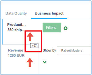
When you hover the cursor on a trend in the BI tab, the loss or win value will be displayed in units. For example, if the loss is increased by 67 units, then a hint will appear, as shown in the following image.
In the DQ tab, hints are not necessary because they just show whether data is better or worse without a quantitative description.
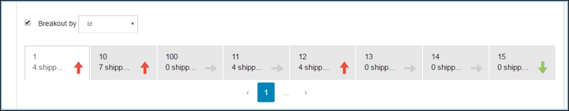
Trends are also available for tabs after a breakout is performed. The following image shows trends for local tabs (after breakout) in the DQ tab.
Trends can also display the field selected in the breakout. The following image shows trends for a local tab (after breakout) in the BI tab.