Using Charts
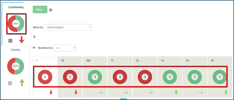
Charts provide a visual representation of data quality records that are currently in the system. They are available in the DQ tab only, within the dimension and local tabs (after breakout), as shown in the following image.
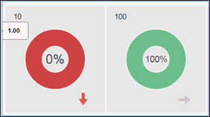
The rules for dimensions are defined in Omni Designer. Those rules also help create the dqconfig.xml file, and are used to calculate whether a record is 'good' (displayed in green) or 'bad' (displayed in red). For example, a rule can state that the social security number field should contain 10 characters. If all records contain a social security number with 10 digits, then the following dimension percentages would be displayed:
Dimension charts have a menu button available for them. At the moment, the only functionality that is implemented there is the Show option, as shown in the following image.
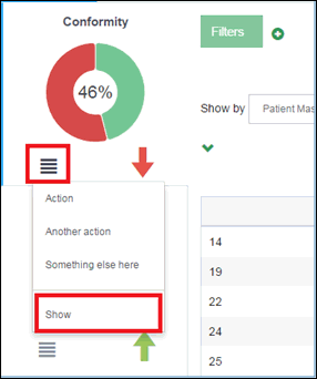
The Show option is a drop-down list, where a list of available options will display when you hover the arrow over it, as shown in the following image.
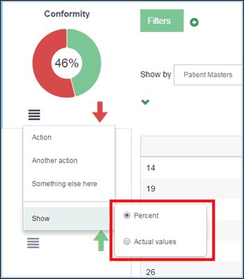
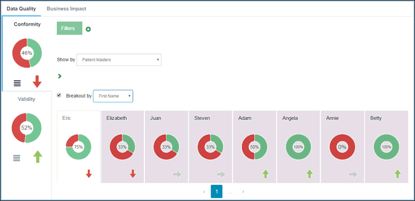
The Show option defines which values are displayed in the chart, either actual values or percentage. Once it is changed, it applies the same values to the local charts after breakout. For more information on Breakouts, see Using Breakouts.