Omni Designer Usage Considerations
|
Topics: |
This section describes several usage considerations for Omni Designer regarding table functionality, validation, and open editors.
Table Functionality
When you are adding a new row in a table, the row is selected and the focus is set in the Name field or the most significant field in the row.
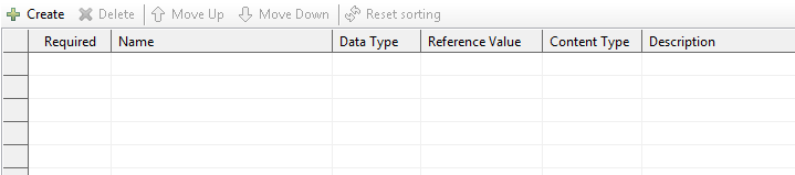
The Create button is always enabled, as shown in the following image. If a table is empty, the Delete button is disabled, but becomes enabled after at least one item is created.
After you delete a row, the preceding row is automatically selected.
When you single-click on a row (any cell), the row becomes selected and the focus is not set on any specific cell. To edit any value in this row, you need to perform an additional click on a specific cell.
Text values are updated. As a result, any extra spaces are trimmed after the focus is removed from a row.
All columns are sortable.
You can change the order of rows by selecting the required row and using the Move Up or Move Down buttons.
Tables are not sorted by default. As a result, the Move Up and Move Down buttons are enabled, but the Reset Sorting button is disabled.
When a column is sorted, the Reset Sorting button is enabled, but the Move Up and Move Down buttons are disabled. When Reset Sorting is clicked, the Reset Sorting button is disabled, but the Move Up and Move Down buttons are enabled.
All column widths can be resized. Horizontal and/or vertical scroll bars appear whenever a table is too large to be displayed in the window.
If a row is not selected, a check box becomes selected after double-clicking it (a single click is responsible for row selection, while double-clicking selects the check box). If a row is selected, a single click is enough to select the check box.
Validation
Validation functions the same way for the Omni Designer Project Editor, all Omni Designer editors, and project/property views.
If a value does not meet specific validation rules that have been defined, the value is marked with a red cross icon. When you mouse over such a cell or field, a tooltip displays a corresponding error message. With regards to an incorrect or failed node in the Omni Designer Project Explorer, the node is also marked with a red cross icon, but a tooltip is not displayed. You can also view error messages in the Problems tab.
After you correct an issue, the red cross icon next to the specific component and the corresponding error row in the Problems tab are removed.
Open Editors
If you try to open an editor for the same node twice, a second instance of the editor does not open. The active window and executable is moved to the editor that is already opened.
If you delete a node, the opened editor for this node will close automatically. If you delete an Omni Designer Project, Input Data Model, or Parent Subject, then the editors for all child nodes are automatically closed.
Wizard Rules
Warning messages in the wizard are displayed with corresponding warning icons and allow you to proceed with a specific process flow (for example, navigation buttons are enabled).
Error messages are displayed with an Error icon and do not allow you to continue the process until some conditions are satisfied (for example, the navigation button becomes disabled).
If an error dialog box appears while working with the wizard (for example, Error OnFinish for a stopped Development Server), after closing the error, the wizard should remain opened.
Viewing Problems
Each error that appears in Omni Designer should have a corresponding description when viewing problems.